WP InView Documentation
Complete reference for features, settings and configuration options
1. Getting Started
WP InView is a WordPress plugin that adds entrance animations to your website. This means that every block on a page can appear in a visually engaging way the moment a visitor scrolls to it. Until the user scrolls to a given element, it remains hidden or in its starting state. Once it enters the viewport, the animation plays.
You do not need to know CSS or JavaScript. All configuration happens directly inside the WordPress block editor. You choose an effect, adjust a few parameters, and the animation runs automatically on every device.
What can you achieve?
- Page elements appear with a slide, zoom, blur, or fade-in effect.
- Each block can have its own animation or inherit global settings.
- Lists and product grids can animate one item after another in a cascade.
- You can add stylish transitions between pages.
Note: WP InView animations are automatically disabled for users who have enabled ‘Reduce Motion’ in their operating system accessibility settings. The plugin respects these preferences, which is important for website accessibility.
2. In-View Animations – Overview
An entrance animation fires the moment a given page element appears in the visible area of the browser window (the viewport). As long as the user has not scrolled to that element, it is hidden or in its starting state. When the element enters the viewport, the animation begins.
How it works, step by step
- The page loads. The plugin scans all blocks that have animations assigned.
- Each such block starts invisible or in its starting position (e.g. shifted downward or transparent).
- As the user scrolls and the element enters the viewport, the animation starts.
- The element smoothly transitions from its starting state to its final state (full visibility, correct position).
How to assign an animation to a block
In the WordPress block editor, click any block. In the right sidebar (Block Settings) you will find the WP InView section. There you can enable the animation and configure its parameters.
You can also set global default values for each animation type in the WP InView admin panel (WordPress menu > WP InView). Blocks without their own settings automatically inherit these global values.
3. Animation Types
An animation type defines the kind of entrance effect applied to a block. The plugin offers five animation types. Each one produces a different visual entrance effect. You can assign one animation type per block and fine-tune its individual parameters.
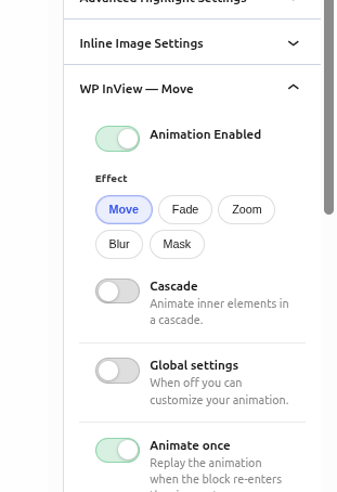
Move – slide in from a direction
The block slides into view from a chosen direction (top, bottom, left, or right) while simultaneously becoming visible. This is one of the most classic and versatile entrance effects available.
Move parameters:
- Direction – The direction from which the element slides in. Options: Up (from below), Down (from above), Left (from the right), Right (from the left). Default: Up.
- Distance -How far the element is offset before the animation, in pixels. The larger the value, the further the slide. Range: 0–200 px. Default: 24 px.
- Opacity From – Starting transparency (see section 4.4).
- Duration – Animation duration in milliseconds (see section 4.2).
- Delay – Delay before the animation starts (see section 4.3).
- Easing – Acceleration curve – how smoothly the animation speeds up and slows down (see section 4.5).
When to use Move? It is an excellent choice for headings, text paragraphs, cards and nearly any page element. The ‘Up’ direction (element slides from below) is the classic, professional-looking option. A large distance (e.g. 80 px) creates a dramatic effect; a small one (e.g. 15 px) is subtle and refined.
Fade – smooth appearance
The element gradually becomes visible by increasing its opacity from a starting value to full visibility. There is no movement – only a change in transparency. This is the most subtle and discreet of the available effects.
Fade parameters:
- Opacity From – Starting transparency (see section 4.4). For the Fade effect this is the main parameter creating the effect.
- Duration – Animation duration in milliseconds (see section 4.2).
- Delay – Delay before the animation starts (see section 4.3).
- Easing – Acceleration curve – how smoothly the animation speeds up and slows down (see section 4.5).
When to use Fade? Ideal for subtle elements such as images, section backgrounds or elements that should not draw too much attention. It also works well as a complement to other animations on the page.
Zoom – scale in or out
The element enters the viewport by changing its size. In Zoom In mode it starts smaller and grows to the target size. In Zoom Out mode it starts larger and shrinks to the correct size. Both modes can be combined with the Rubber spring-bounce effect.
Zoom parameters:
- Zoom Mode – Zoom direction: ‘In’ (element grows to its target size) or ‘Out’ (element shrinks to its target size).
- Scale From – Starting scale as a decimal number. For Zoom In: values from 0.75 to 0.99 (e.g. 0.92 means starting at 92% of the final size). For Zoom Out: values from 1.01 to 1.25 (e.g. 1.10 means starting at 110% of the final size).
- Rubber – Spring-bounce effect at the end of the animation – the element slightly overshoots its target and returns (see section 4.6).
- Opacity From – Starting transparency (see section 4.4). For the Fade effect this is the main parameter creating the effect.
- Duration – Animation duration in milliseconds (see section 4.2).
- Delay – Delay before the animation starts (see section 4.3).
- Easing – Acceleration curve – how smoothly the animation speeds up and slows down (see section 4.5).
When to use Zoom? Works great for cards, images, buttons and elements you want to highlight. Zoom In with a Scale From value of 0.92–0.96 gives a subtle, elegant effect. Values closer to 1.0 produce a more discreet result.
Blur – blur-to-sharp entrance
The element enters the viewport gradually sharpening – it begins as a blurry shape and comes into focus. This effect gives the page a modern, cinematic quality.
Blur parameters:
- Blur From – Blur strength at the start of the animation, in pixels. A value of 10 is a gentle blur; 30+ is strong and dramatic. Range: 0–250 px. Default: 10 px.
- Opacity From – Starting transparency (see section 4.4). For the Fade effect this is the main parameter creating the effect.
- Duration – Animation duration in milliseconds (see section 4.2).
- Delay – Delay before the animation starts (see section 4.3).
- Easing – Acceleration curve – how smoothly the animation speeds up and slows down (see section 4.5).
Performance note: the Blur effect uses a CSS filter which may be less smooth on older devices than the
other animation types. Test on mobile devices if you apply Blur to many elements simultaneously.
Mask Reveal – wipe reveal
The element is covered by a mask that gradually moves aside, revealing its content. The effect looks like drawing back a curtain to uncover an image or text. This is a very modern and elegant effect, popular on portfolio and agency websites.
Mask Reveal parameters:
- Direction – Direction of the mask reveal: Up, Down, Left, Right, Horizontal (from both sides), Vertical (from top and bottom).
- Feather – Softness of the mask edge in pixels. A value of 0 gives a hard edge; larger values create a smooth, gradual transition. Range: 0–250 px. Default: 24 px.
- Inset – How much of the element is covered at the start of the animation, as a percentage. A value of 100% means the element is fully hidden at the beginning. Range: 5–100%. Default: 20%.
- Opacity From – Starting transparency (see section 4.4). For the Fade effect this is the main parameter creating the effect.
- Duration – Animation duration in milliseconds (see section 4.2).
- Delay – Delay before the animation starts (see section 4.3).
- Easing – Acceleration curve – how smoothly the animation speeds up and slows down (see section 4.5).
When to use Mask Reveal? Ideal for images, section headings and hero elements. The effect is striking – use it sparingly on key elements of the page so as not to overwhelm the visitor.
4. Animation Settings
The following settings are shared across all or most animation types. They allow you to precisely tune the pace, delay and character of every animation.
4.1 Animate Once
This option determines whether the animation plays only once (on the first time the element enters the viewport) or every time the element appears on screen as the user scrolls.
Options:
- Enabled (default): The animation plays only once. After the first playback the element remains visible
regardless of further scrolling. - Disabled: The animation replays every time the element enters the viewport. If the user scrolls down
and then back up, the animation plays again.
Recommendation: for most sites, leave this set to ‘once’. Repeated playback can be tiresome for users scrolling back and forth. Repeated playback makes sense for elements such as counters or interactive animated icons.
4.2 Duration
The animation duration measured in milliseconds (ms). It determines how long the transition from starting state to final state takes.
Reference values
- 150–300 ms: very fast, almost imperceptible. Good for small UI elements.
- 400–600 ms: fast, responsive animation. Standard choice for most elements.
- 650–900 ms: natural, elegant pace. The plugin default is 650 ms.
- 1000–2000 ms: slow, ceremonial animation. Good for hero elements and large sections.
- Above 2000 ms: very slow. Use with care – it may feel like the page is lagging.
How to enter a value: click the field and type a number. Confirm with Enter or by clicking outside the field. Range: 100–6000 ms. Values outside the range are automatically clamped to the nearest allowed value.
4.3 Delay
The time in milliseconds that passes from the moment the element appears in the viewport to the moment the animation starts. The element is invisible during this period and then begins to animate.
Range: 0–5000 ms. Default: 0 (no delay).
When to use delay?
- When several elements appear in the same area – giving each a different delay creates a visual sequence (similar to Cascade).
- When you want to give the user a moment to settle on the page before an important element appears.
- For hero animations – a slight delay (200–400 ms) makes the page entrance feel more dramatic.
How to enter a value: click the field and type a number. Confirm with Enter or by clicking outside the field. Range: 100–6000 ms. Values outside the range are automatically clamped to the nearest allowed value.
4.4 Opacity From
Determines how transparent the element is at the beginning of the animation. A value of 0 means fully invisible; a value of 1 means fully visible (no transparency effect). The animation always ends at full visibility.
Range: 0–1. Step: 0.05. Default: 0.
Example values
- 0.0 – the element is completely invisible at the start (classic fade-in).
- 0.2 – the element is barely visible at the start, a light fade.
- 0.5 – the element is half-transparent at the start.
- 1.0 – no transparency effect; the element is immediately visible.
4.5 Easing
Easing defines how the animation accelerates and decelerates over time. Two animations of the same length can look completely different depending on their curve. Think of it like a driver pulling away from traffic lights – they can pull away smoothly, sharply, or with a hesitation.
Available profiles
- Smooth: Soft, natural acceleration. A good choice for most animations.
- Standard: Google Material Design standard curve. Fast start, smooth stop.
- Ease Out: Fast start, gradually slowing towards the end. Most commonly used for entering elements.
- Ease In-Out: Slow start, acceleration in the middle, slow stop. Elegant for longer animations.
- Linear: Constant pace throughout. Mechanical; rarely desirable.
- Custom: Enter your own cubic-bezier() value. For advanced users.
For beginners: choose ‘Smooth’ or ‘Ease Out’ – they work well in 90% of cases. If an animation feels ‘stiff’, switching the easing to ‘Smooth’ usually fixes it.
4.6 Rubber (Zoom only)
Rubber is an option available exclusively for the Zoom animation type. It adds a slight ‘spring bounce’ to the end of the animation – the element reaches its target size, slightly overshoots it, and then snaps back to the correct position. The effect resembles a spring or a rubber band.
This effect adds organic energy to the animation. It is popular in mobile applications and modern interfaces.
Available profiles
- Off: No spring bounce. The animation ends smoothly at the target size.
- Soft: Gentle bounce, almost imperceptible. Subtle and refined.
- Medium Moderate bounce. A good balance between subtlety and visual impact.
- Hard: Pronounced bounce. The element noticeably overshoots the target before returning.
- Custom: Manual mode – lets you set the bounce amplitude yourself.
Rubber Amplitude (Custom mode)
The bounce amplitude is a value from 0 to 0.1 that determines how far the element overshoots its target size. A value of 0.035 means 3.5% overshoot – if the element’s final width is 100 px, during the bounce it will reach approximately 103.5 px and then return to 100 px.
- 0.02 (2%): very gentle bounce, comparable to Soft mode.
- 0.035 (3.5%): moderate bounce, comparable to Medium mode.
- 0.055 (5.5%): pronounced bounce, comparable to Hard mode.
- 0.10 (10%): maximum available bounce, very strong.
For Zoom Out (the element shrinks): the amplitude works in reverse – the element is momentarily smaller than the target before returning to the correct size. The visual effect is equally pleasant as for Zoom In.
5. Animation Trigger
The trigger defines exactly when an animation fires – how much of the element must be visible and at what position. This is one of the most important settings affecting the user’s experience while scrolling.
5.1 Threshold
Threshold is a value from 0 to 1 that specifies what fraction of the element must be visible in the browser window for the animation to fire.
Understanding the values
Imagine an element that is 400 pixels tall. A threshold of 0.15 means the animation fires when 60 pixels of the element (15% of 400 px) are visible in the browser window.
- 0.0: The animation fires the instant even a single pixel of the element enters the viewport.
- 0.10: The animation fires when 10% of the element is visible.
- 0.15: The default value. A good balance – the element is already somewhat visible before the
animation starts. - 0.25: The animation fires when one quarter of the element is visible.
- 0.50: The animation fires when half the element is visible.
Important: high threshold values (e.g. 0.5) can cause the animation to never fire on mobile devices if the
element is taller than half the screen. A phone cannot show 50% of an element taller than its own
screen. A safe maximum is usually 0.20–0.25.
5.2 Root Margin – trigger offset
Root Margin is an advanced setting that lets you expand or shrink the area in which the animation is triggered. It acts like an invisible margin around the browser window.
The value format is the same as the CSS margin shorthand: top right bottom left. You can use pixels (px) or percentages (%).
Examples and their meaning
0px 0px -10% 0px
The most commonly used configuration. The negative bottom value (-10%) shrinks the trigger area by 10% from the bottom of the window. The animation fires when the element reaches 10% from the bottom edge of the screen – meaning the element must travel slightly deeper into the viewport before the animation starts. This creates the feeling that the animation fires when the element is already clearly visible.
0px 0px 100px 0px
A positive bottom value (100px) expands the trigger area by 100 px downward. The animation fires before the element is visible on screen – the element starts animating ahead of time. Useful when the animation is long and you want the element to already be mid-animation when it reaches the viewport.
0px
Writing just 0px or 0px 0px 0px 0px means no modification – the animation fires exactly at the edge of the viewport.
For beginners: do not adjust Root Margin manually. Use the preset trigger profiles (see section 5.3) which set appropriate values automatically. Root Margin only makes sense when using the ‘Custom’ trigger mode.
5.3 Preset trigger profiles
Instead of manually setting Threshold and Root Margin, you can choose a trigger trigger profile. Each profile has carefully tuned values for a specific feel.
- Natural – The default profile. The animation fires when the element is clearly visible in the window. A good choice for most cases.
- Early Bird – The animation fires slightly earlier than Natural. The element starts animating when it is still almost off-screen. Gives a more dynamic feel.
- On Focus – The animation waits until the element is more visible than with Natural. Good when you want the element to be clearly in focus before it appears.
- Just In Time– The animation fires exactly when the element enters the viewport, with no margins. Very precise and predictable.
- Late Entrance – The animation fires late, when the element is already prominently visible. Good for elements that should capture attention at the right moment.
- Custom – Manual mode. Allows you to set Threshold and Root Margin by hand (see sections 5.1 and 5.2).
6. Cascade – staggered animation
Cascade animates child elements one after another, creating a stagger effect. Instead of all elements appearing at once, each one enters with a small delay — giving your content a natural, flowing feel. Enable Cascade per block in the editor sidebar or popup panel.
How it works
When Cascade is enabled on a block, WP InView finds the child elements inside it and assigns each one a progressively longer delay. The first element animates immediately, the second after one step, the third after two steps, and so on.
The effect, easing, and trigger are inherited from the parent block’s settings — Cascade only controls the timing stagger.
Choosing which elements animate
By default, WP InView auto-detects which children to animate. It walks down the DOM tree until it finds a node with more than one visible child, then takes those children. This works well for simple layouts, but Gutenberg often wraps content in extra divs — so auto-detect may grab the wrong level. You have two ways to take control.
The .iv-item marker class
Add the class iv-item to any elements you want to include in the cascade. WP InView will always collect these elements regardless of other settings — you cannot suppress this behavior. This is the recommended approach. It works reliably regardless of how deeply nested your elements are, and it survives theme or block markup changes.
Example — pricing table with feature lists:
html
<div class="pricing-wrapper">  <!-- Cascade enabled here -->
  <div class="plan">
    <li class="iv-item">Unlimited users</li>
    <li class="iv-item">Priority support</li>
    <li class="iv-item">Custom domain</li>
  </div>
  <div class="plan">
    <li class="iv-item">5 users</li>
    <li class="iv-item">Email support</li>
  </div>
</div>
All five <li> elements animate in sequence across both columns — one cascade on the wrapper handles everything.
Custom selector
In the global Cascade settings (WP InView → Cascade → Child selector ), you can enter a CSS selector to target specific elements. The selector is scoped to the cascade root — it searches within the block, not the whole page.
li | All list items inside the block |
img | All images |
.your-class | Elements with a custom class |
.wrapper li | List items inside a specific wrapper |
Learn more about CSS Selectors
The custom selector adds elements on top of any .iv-item elements already found. If neither finds anything, auto-detect kicks in.
Note: if your selector references a class that sits above the cascade root (e.g. .custom-class is on a parent element), it will not be found — the search starts from the cascade block itself downward.
Delay: global step vs block delay
The timing between each child is controlled by Step — set globally in WP InView → Cascade settings.
Step (global) — the default delay between each child, in milliseconds. A step of 120ms means: first child at 0ms, second at 120ms, third at 240ms, and so on.
Block delay — the Delay value set on the block itself (in the animation panel). When a block has its own delay set, it overrides the global step. This lets you slow down or speed up a specific cascade without touching the global setting.
If the block delay is 0 (or not set), the global step is used.
Limit
Limit controls the maximum number of children that will animate. If your container has more children than the limit, the extra ones are ignored.
Why it exists: animating a very large number of elements in sequence creates a long tail — the last element might not animate until several seconds after the first. This is rarely the intended effect and can feel broken on slower devices.
The default limit is 24, which covers most real-world use cases — a three-column pricing table with 8 features per column fits within a single cascade. Increase the limit if you need more, but keep performance in mind: each animated element adds work for the browser.
Nested cascades
You can place a cascade inside another cascade — for example, a section with cascade enabled, containing a card that also has cascade enabled.
WP InView isolates each cascade to its own root. Inner cascade elements are not captured by the outer cascade, and vice versa.
However, the timing can get complex — the inner cascade’s delay is added on top of the outer cascade’s delay for that card. Test carefully and adjust the step values to get the rhythm you want.
A warning is shown in the editor when nested cascades are detected. → Learn more about nested cascades
7. Global settings vs. block settings
WP InView has two levels of configuration: global (affecting the whole site) and local (affecting a specific block). Understanding this hierarchy lets you manage animations efficiently on larger sites.
Global settings
In the WordPress admin panel (WP InView menu) you can set default parameters for each animation type. For example: the default duration for the Move animation type is 650 ms, the default easing is Ease Out, and so on.
These values are used by all blocks that have ‘Global settings’ enabled (the default). Changing a global value instantly affects all blocks that rely on global settings.
Block settings (Custom mode)
When you disable ‘Global settings’ in the block sidebar, the block switches to Custom mode. In this mode you can set your own parameter values for that one block only – they override the global settings.
Strategy: set global values to work well for most elements on the site. Only switch blocks that genuinely need a different effect to Custom mode. This makes it much easier to maintain a consistent animation style across the entire site.
8. Page Transition
Page Transition adds an animated transition when navigating between pages. When a user clicks a link, instead of an instant page reload an animated transition plays – similar to those found in mobile applications.
This feature is enabled and configured in the WP InView admin panel, under the Page Transition tab. It applies globally to the entire site.
Available variants
Fade
The page gradually fades out, a coloured overlay appears, and then the new page gradually fades in. The simplest and most universal transition variant.
- Duration – Transition effect duration in milliseconds.
- Easing – Acceleration curve for the transition.
- Overlay Color – Color of the overlay during the transition. Default: white.
- Overlay Opacity – Opacity of the overlay. 1.0 = the overlay fully covers the page.
Blur
The page is blurred and fades out, then the new page fades in while coming into sharp focus. A modern, cinematic transition effect.
- Duration – Transition effect duration in milliseconds.
- Easing – Acceleration curve for the transition.
- Blur Amount – Blur intensity during the transition, in pixels.
- Overlay Color – Color of the overlay during the transition. Default: white.
- Overlay Opacity – Opacity of the overlay. 1.0 = the overlay fully covers the page.
Curtain
A coloured overlay slides in from a chosen direction, covering the page, and then slides out to reveal the new page. Like a theatre curtain.
- Duration – Transition effect duration in milliseconds.
- Easing – Acceleration curve for the transition.
- Direction – The direction from which the curtain enters: Left, Right, Top, Bottom, Center.
- Overlay Color – Color of the overlay during the transition. Default: white.
- Overlay Opacity – Opacity of the overlay. 1.0 = the overlay fully covers the page.
Technical note: Page Transition only works for internal links on the same domain. External links, file links and anchors (# URLs) are bypassed by the transition mechanism.
9. Settings
The Settings tab controls how WP InView behaves in the WordPress editor. These options affect the editing experience only – they have no impact on how animations look on your live site.
9.1 UI Language
Changes the language of the plugin interface – both in the block editor panel and in the admin dashboard.
- Auto – follows your WordPress language setting. If WordPress is set to Polish, the plugin switches to Polish automatically. For all other languages the interface stays in English.
- English – forces English regardless of your WordPress language.
- Polski – forces Polish regardless of your WordPress language.
9.2 Block Editor Panel
Controls where the animation controls appear when you click a block in the editor:
Floating popup
A small WP InView button appears in the block toolbar. Clicking it opens a draggable panel that you can move and resize freely anywhere on the screen. The panel remembers its position between editing sessions.
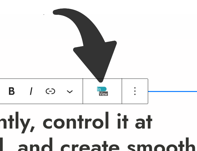
Sidebar
The animation controls appear directly in the block Inspector panel on the right side, alongside other block settings like color and spacing. No toolbar button, no popup.
Which one should I choose? Floating popup works well if you edit full-screen and want controls out of the way. Sidebar is better if you prefer everything in one place or if your theme or page builder modifies the toolbar.
After changing this setting, reload the editor for the change to take effect.
9.3 List View Badges
When turned on, any block that has an animation assigned shows a small label next to its name in the List View panel (the block tree on the left side of the editor). The label shows the animation type – for example Move or Zoom.
- Floating popup – a small WP InView button appears in the block toolbar. Clicking it opens a draggable panel that you can move and resize freely anywhere on the screen. The panel remembers its position between editing sessions.
- Sidebar – the animation controls appear directly in the block Inspector panel on the right side, alongside other block settings like color and spacing. No toolbar button, no popup.
Which one should I choose? Floating popup works well if you edit full-screen and want controls out of the way. Sidebar is better if you prefer everything in one place or if your theme or page builder modifies the toolbar.
After changing this setting, reload the editor for the change to take effect.
9.4 Reset Settings
Restores every WP InView setting to its original default value. This includes all animation settings, cascade settings, and page transition settings — not just this tab. A confirmation prompt appears before anything is changed.
This cannot be undone. If you have a custom configuration you want to keep, note down your settings before resetting.
Help Improve WP InView
Found a bug or missing detail? Let us know – we review every report.
WP InView is open source.
The code is free. The time behind it isn’t.
If it saves you time or improves your projects, consider supporting its development.
Your support helps fund new presets, improvements, fixes, and long-term maintenance.
No paywalls. No locked features.
Just focused, independent development.